LayoutsTip
TipMenu
Now with added tooltips!
General styles
This section covers various styles such as <h1></h1> and
<p> as well as specifically styled areas. (This line is presented
in a <p> tag and the code elements are displayed within <code></code>
tags.
This is H1
This is H2
This is H3
This is H4
This is H5
.title used globally
Title
Block areas of the center panel can be are subdivided into .halfDivider,
.twoThirdDivider and .thirdDivider (Full width is the
default for any block element added). The grey background is for visual illustration
only and not part of the CSS definition.
.halfDivider
.halfDivider
.twoThirdsDivider
.thirdDivider
.thirdDivider
.thirdDivider
.thirdDivider
This example places a .thirdDivider within a .twoThirdsDivider
which enables us to have a repeating number of defined elements contained within
two thirds of the available space. The pale blue background is for visual illustration
purposes only and not part of the CSS definition.
[Customer A name]
Work No: [01234 567 890]
Home No: [01234 567 890]
Mobile No: [01234 567 890]
Email: [abcdefg.hijklmno@zxcvbnnm.com]
[Customer B name]
Work No: [01234 567 890]
Home No: [01234 567 890]
Mobile No: [01234 567 890]
Email: [abcdefg.hijklmno@zxcvbnnm.com]
[Customer C name]
Work No: [01234 567 890]
Home No: [01234 567 890]
Mobile No: [01234 567 890]
Email: [abcdefg.hijklmno@zxcvbnnm.com]
.thirdDivider
Message blocks
Typically used for either areas of the page expecting data where no records are returned or to give specific feedback to user after an action such as a search or performing a postback of large amounts of data.
iYour changes have been made and will appear within the next 24 hrs.
view codeSample HTML code
<div class="generalMessage">
    <h3><span class="icon32 icon-info32">i</span> Your changes have been made and will appear within the next 24 hrs. </h3>
</div>
iYour changes were succesfully saved.
view codeSample HTML code
<div class="generalMessage success">
    <h3>
        <span class="icon32 icon-tick32">i</span>Your changes were succesfully saved.</h3>
</div>
iAre you sure you wish to delete this?
view codeSample HTML code
<div class="generalMessage deleteAction">
    <h3>
        <span class="icon32 icon-warning32">i</span>Are you sure you wish to delete this?</h3>
</div>
This background is used where a given part of a project has not yet been completed.
view codeSample HTML code
<div class="underConstruction">
    <p>This background is used where a given part of a project has not yet been completed.</p>
</div>
Summary styling
It is often required to bring together information in read only format to get a
quick general summary of a given solution. This is achieved by presenting the data
within <div class="generalMessage summaryBox"> … </div>
This example incorporates 3 columns of information using the .thirdDivider
class.
[Title 1]
[Customer A name]
Work No: [01234 567 890]
Home No: [01234 567 890]
Mobile No: [01234 567 890]
Email: andrew.baker-...
Customer address
[address]
[address]
[address]
[address]
[Customer A name]
Work No: [01234 567 890]
Home No: [01234 567 890]
Mobile No: [01234 567 890]
Email: andrew.baker-...
[Title 2]
Contact: [xxxxxxxx]
Telephone: [xxxxxxxx]
Email: andrew.baker-...
[Title 3]
CAM: [xxxxxxxx]
CSM: [xxxxxxxx]
view codeSample HTML code
<div class="generalMessage summaryBox">
            <div class="thirdDivider">
                <h3>
                    [Title 1]</h3>
                <p>
                    <b class="title">[Customer A name]</b><br />
                    <span class="inlineLabel">Work No:</span> [01234 567 890]<br>
                    <span class="inlineLabel">Home No:</span> [01234 567 890]<br>
                    <span class="inlineLabel">Mobile No:</span> [01234 567 890]<br>
                    <span class="inlineLabel">Email:</span> <a href="mailto:anthony.hall@movewithus.co.uk"
                        title="anthony.hall@movewithus.co.uk">andrew.baker-...</a>
                </p>
                <p>
                    <b class="title">Customer address</b><br>
                    [address]<br>
                    [address]<br>
                    [address]<br>
                    [address]<br>
                </p>
            </div>
            <div class="thirdDivider">
                <h3>
                     </h3>
                <p>
                    <b class="title">[Customer A name]</b><br>
                    <span class="inlineLabel">Work No:</span> [01234 567 890]<br />
                    <span class="inlineLabel">Home No:</span> [01234 567 890]<br />
                    <span class="inlineLabel">Mobile No:</span> [01234 567 890]<br />
                    <span class="inlineLabel">Email:</span> <a href="mailto:anthony.hall@movewithus.co.uk"
                        title="anthony.hall@movewithus.co.uk">andrew.baker-...</a>
                </p>
            </div>
            <div class="thirdDivider">
                <h3>
                    [Title 2]</h3>
                <p>
                    <span class="inlineLabel">Contact:</span> [xxxxxxxx]<br />
                    <span class="inlineLabel">Telephone:</span> [xxxxxxxx]<br />
                    <span class="inlineLabel">Email:</span> <a href="mailto:anthony.hall@movewithus.co.uk"
                        title="anthony.hall@movewithus.co.uk">andrew.baker-...</a>
                </p>
                <h3>
                    [Title 3]</h3>
                <p>
                    <span class="inlineLabel">CAM:</span> [xxxxxxxx]<br />
                    <span class="inlineLabel">CSM:</span> [xxxxxxxx]
                </p>
            </div>
        </div>
Table layout
Tables must include the <thead> and <tbody>
tags in the HTML.
The table tag needs to have the following class <table class="coreTable">
which is picked up by the jQuery tableSorterCheck() function which
provides zebra striping and client-side column ordering.
The text within each th tag needs to be wrapped within <span class="editor-label"></span>
view codeSample HTML code
<table class="coreTable">
    <thead>
        <th>
            <span class="editor-label">Heading A</span>
        </th>
    </thead>
    <tbody>
        <tr>
            <td>[Data]</td>
        </tr>
    </tbody>
</table>
To activate the appropriate styling and functionality tableSorterCheck();
is required to be called either in the initial page $(document).ready
function or as part of an Ajax callback.
| Heading A | Heading B | Heading C | Heading D |
|---|---|---|---|
| [Data] | [Data] | [Data] | [Data] |
| [Data] | [Data] | [Data] | [Data] |
| [Data] | [Data] | [Data] | [Data] |
| [Data] | [Data] | [Data] | [Data] |
Tables with buttons
| Heading A | Heading B | Heading C |
Edit column
Tip
TipEdit Column
The column used for actions is held at a fixed width by adding |
|---|---|---|---|
| [Data] | [Data] | [Data] | |
| [Data] | [Data] | [Data] | |
| [Data] | [Data] | [Data] | Hyperlink slim button |
| [Data] | [Data] | [Data] | Hyperlink slim button |
Fixed column tables
On occasion you may have two independent tables with the same amount of columns; these usually don't align well without help.
Adding one of the following classes to the <table> element will
force the td cells to a specific width:
.twoColumns
.threeColumns
.fourColumns
.fiveColumns
This is a .fourColumn example:
| Col 1 | Col 2 | Col 3 | Col 4 | Edit |
|---|---|---|---|---|
| [Data] | [Data] | [Data] | [Data] | |
| [Data] | [Data] | [Data] | [Data] |
| Col 1 | Col 2 | Col 3 | Col 4 | Edit |
|---|---|---|---|---|
| [Data] | [Data] | [Data] | [Data] | |
| [Data] | [Data] | [Data] | [Data] |
All MWU brand colors
| #220176 | #00aff0 | #a6ce39 | #576a1a | #ffdd00 | #ee2c39 | #e21a72 |
| #8686c1 | #73c2ed | #d1e39a | #f68b1f | #ffeb95 | #850b13 | #8d4795 |
| #c5c6c8 | #e0e1e2 | #ffffff | #d59f0f | #eac885 | #9c7d0d | #cdb67b |
| #4d917b | #9ec1b3 | #a0c3da | #caddea | #939598 | #c6c8ca | #939598 |
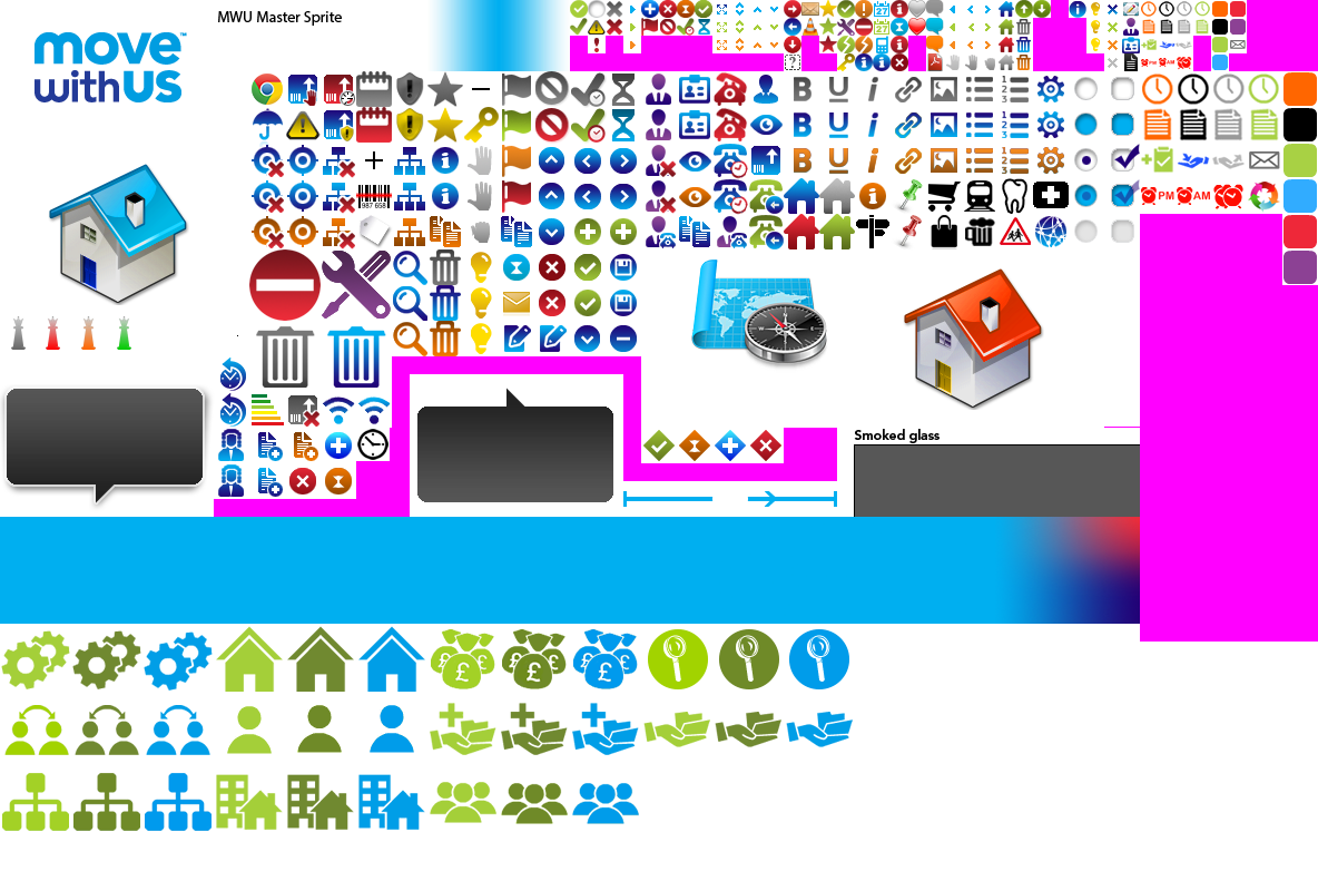
Iconography
This is the current master sprite (click for full size view).
The sprite is set up to accomodate standard system icon sizes by allocating areas in divisions of 16px. Magenta areas are defined as areas available to add new icons. Clear space around icons needs to be kept to avoid other icons "leaking" into the area designated for a specific icon.
Icons in use
Icons are generally displayed in either 16x16 or 32x32 pixels. The element to used
as an icon starts with .icon16 or .icon32 followed by
the specific style required, eg: class="icon32 icon-taskOutcome1-32"
The following icons are in active use.
Other icons within the sprite have been used (outside of MASLAYAS) in other projects such as Market appraisal and may be of use in future development.
16px x 16px
Lightbulb
icon-Lightbulb
Warning
icon-Warning16
Exit/Delete
icon-exit16
Info icon-info16
Orange
icon-orange16
Clipboard
icon-clipboard116
Clipboard+ icon-clipboardPlus16
Envelope
icon-envelope16
Blue icon-blue16
Assign to me icon-assignedToMe
Assign by me icon-assignedByMe
Grab icon-hand16
Info important icon-infoImportant16
Red icon-red16
Clipboard
icon-clipboard216
HandLeft
icon-handLeft16
AlarmPm
icon-alarmPm16
Approaching overdue icon-approchingOverdue
Tick icon-tick16
Trash icon-trash16
Tools icon-tool16
Purple
icon-purple16
Clipboard
icon-clipboard316
HandRight
icon-handRight16
AlarmAm
icon-alarmAm16
Clock
icon-clock116
Clock
icon-clock216
Clock
icon-clock316
Clock
icon-clock416
Black icon-black16
Clipboard
icon-clipboard416
Green icon-green16
AlarmUrgent icon-alarmUrgent16
32px x 32px
No
contact icon-taskOutcome1-32
Call back request icon-taskOutcome2-32
Refer back to agent icon-taskOutcome3-32
Proceed
icon-taskOutcome4-32
or icon-tick32
Non-proceed icon-remove32
or icon-taskOutcome5-32
incomming call icon-taskOutcome6-32
Leave agent message icon-taskOutcome7-32
No agent
icon-taskOutcome8-32
Customer
icon-customer32
Lawyer
icon-lawyer32
Add icon-Add32
Copy icon-copy32
Assigned
icon-assigned32
Assigned excluded icon-assignedExcluded32
Inherited
icon-inherited32
Inherited excluded icon-inheritedExcluded32
Alarm Urgent icon-alarmUrgent32
Green icon-green32
Refresh
icon-refresh32
Add note
icon-AddNote32
Annoucement32 icon-Annoucement32
Chrome
icon-chromeBrowser32
Warning
icon-warning32
Mail icon-mail32
Web icon-web32
Address
icon-address32
Conveyancing icon-conveyancing-32
Save icon-save32
Manage
icon-manage32
Edit icon-edit32
Results
icon-results32
Trash icon-trash32
Info icon-info32
Expand
icon-expand32
Contract
icon-contract32
Alarm Pm
icon-alarmPm32
Alarm Am
icon-alarmAm32
Blue icon-blue32
Time
travel icon-timeTravel32
White label icon-whiteLabel-32
Self service icon-selfService-32
Down icon-down32
up icon-up32
Left icon-moveLeft32
Right
icon-moveRight32
Search
icon-search32
Products
icon-products-32
Products NA icon-productsNA-32
Products hold icon-productsHold-32
Products max icon-productsMax-32
Products related icon-productsRelated-32
ID check
icon-IdCheck32
EPC icon-epc32
Insurance
icon-Insurance32
Grab hand
icon-hand32
Orange
icon-orange32
Red icon-Red32
Grey king
icon-greyKing32
Red king
icon-redKing32
Orange king
icon-orangeKing32
Green king
icon-greenKing32
Black clock
icon-blackClock32
Clock1
icon-clock132
Clock2
icon-clock232
Clock3
icon-clock332
Clock4
icon-clock432
Clipboard1
icon-clipboard132
Clipboard2
icon-clipboard232
Clipboard3
icon-clipboard332
Clipboard4
icon-clipboard432
Clipboard Plus icon-clipboardPlus32
Hand Left
icon-handLeft32
Hand Right
icon-handRight32
Envelope
icon-envelope32
Black icon-black32
Purple
icon-purple32
64px x 64px
Trash icon-trash64
Manage Users Active icon-manageUsersActive64
Advance Search Active icon-advanceSearchActive64
Pricing icon-pricing64
Pricing Active icon-pricingActive64
Manage Users icon-manageUsers64
Create Lead icon-createLead64
Create Lead Acive icon-createLeadActive64
Advance Search icon-advanceSearch64
Manage Teams icon-manageTeams64
Team Leader Dashboard icon-teamLeader64
Team Leader Dashboard icon-teamLeaderActive64
Settings icon-settings64
Manage Teams Active icon-manageTeamsActive64
Home Dashboard icon-homeDashboard64
Home Dashboard Active icon-homeDashboardActive64
Settings Active icon-settingsActive64
Manage Teams Active icon-manageTeamsActive64
Manage Hierarchies icon-hierarchies64
Manage Hierarchies Active icon-hierarchiesActive64
Manage Supplier Agents .icon-supplierAgents64
Manage Supplier Agents Active icon-supplierAgentsActive64
Others
The larger house and map images on the sprite are used as placeholders for the Drag & drop images section (for more imformation follow the link).
Icon tutorial
Icons should follow the MWU non-skeuomorphic style presenting a flat visual representation in the MWU brand colours.
Interactive elements have at least three states; passive, hover, active.
There are seven steps to creating a basic MWU icon in Photoshop:
For the purpose of this tutorial, we are imagining the need for a new product icon to convey 'Insurance'.
Insurance is about protection and 'rainy days' so it would seem that the most appropriate icon would be an umbrella.
This will be a single instance icon (no hover or active states) and be 32px x 32px.
The best resource for free icons is www.iconfinder.com
Search for 'umbrella', and when the results page loads check the 'free' button.
Scan through the results for something close to a design that would fit well with the MWU brand and other icons style.
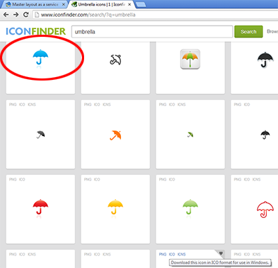
Check the license details associated with the icon to make it is free for commercial use, if so, download it.
Open Sprite.psd from the MASLAYAS\Design assets repository and drop your new icon from it's folder onto the canvas. It will appear with resize drag handles. For now just press enter to place it on the canvas.
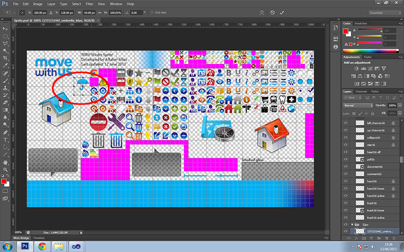
You will now have a smart object layer in the layers palette on the right named something like '1371151442_umbrella_blue'. Double click this layer to rename it appropriately to 'Umbrella32' and drag it into the appropriate 32px folder if it's not there already.
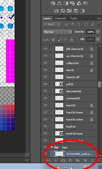
We won't be using any of the features of smart objects so rightclick on the layer and choose 'Rasterize layer'.
Save!
We are going to occupy a 32px x32px space currently filled with magenta.
Magenta is used to denote available space in the sprite. This is done for two main reasons:
1. To clearly identify usable space as some transparent space may be part of another image, such as the space required around the larger houses.
2. As a debugging guide when in place in code; it's much easier to indentify a slab of magenta where an icon should be than a blank space which semantically may be missed as an error during development and testing.
Navigate to the top of the layers palette and highlight a layer called 'window to the world'.
Choose the square marquee tool from the left palette menu and draw a 32px x32px rectangle over your chosen magenta space and press delete.
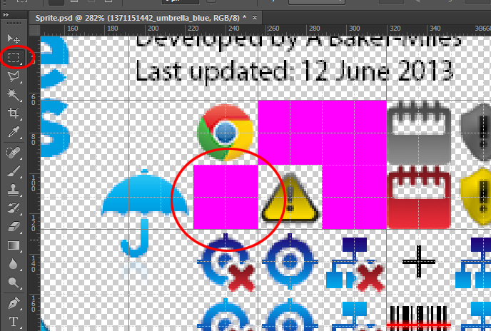
Right click on the umbrella icon and choose it from the context menu. This will highlight it in the layers palette.
Press CTRL+T to activate the transform tool and you should see drag handles appear around the icon. Manipulate the icon until it comfortably sits in the 32px square space you have chosen, then press enter to set it.
Save!
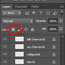
Lock the transparent pixels by clicking the small checked box at the top of the layers palette. A padlock should appear on the chosen layer.
Click the foreground colour palette and a colour picker dialogue should appear. Enter the hex value 220176 (MWU dark blue ) and click enter.
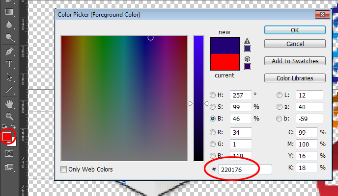
Click the background colour palette and enter the hex value 00aff0 (MWU light blue ) and click enter.
You now have the foreground and background colours set for the gradient fill.
Choose gradient tool from the tools palette.
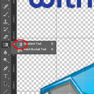
From the top ribbon menu ensure the colour range is foreground to background and linear gradient is chosen.
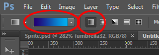
Now Start a mouse drag fom the top of the icon to the base and release. With the transparent pixels locked on the layer the only thing subject to the gradient fill should be the icon from dark blue at the top to light blue at the bottom.
Save!
The sprite is saved as 32bit png to retain transparency on the web.
From the main Photoshop file menu choose 'Save for web'.
A preview dialogue box will appear. Ensure it is set to png and the transparency box is checked, then click 'Save'
Navigate to the MASLAYAS\MasterLayout\Content\Images folder and replace the existing version.
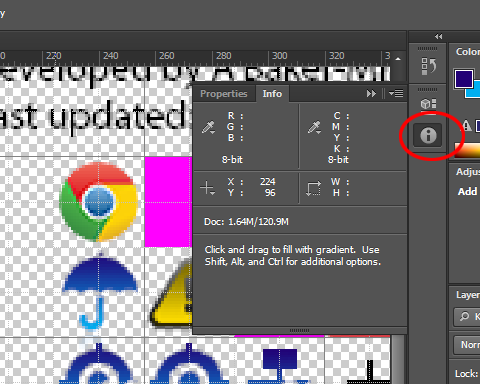
To create a CSS icon that uses your new umbrella you will need the x and y position from the sprite.
Click the info icon from the top right canvas palette which will open the info panel.
Move your mouse to the top left hand edge of the icons allocated space the the x and y information will be displayed for you make a note of.
Adding icon to CSS and HTML use
Once you have a new icon and have taken note of its x and y co-ords you can create the CSS definition for it.
Add a new entry amongst the other icon definitions in MasterSite.css with an appropriate name. Define the background position in negative values. This is because we are creating a 'window' with an element and displaying the sprite as a background image which will by default start at the image's 0,0 x,y coordinate. Therefore we have to set the background position to a negative value to move the image left and up.
view codeSample CSS code
.icon-Insurance32
{
    background-position: -224px -96px;
}
To display this icon on a page create an element, such as an <a>
and add the classes icon32 icon-Insurance32 (for example).
This will display: Insurance
view codeSample HTML code
<a class="icon32 icon-Insurance32">Insurance</a>